A21HP0139-Assignment-1-Reflection-Magazine

1 Comment
Submit a Comment
You must be logged in to post a comment.

at codesign, we cultivate a vibrant community where creativity and critique intertwine, fostering collaboration, sparking meaningful dialogue, and inspiring innovation among our members.
You must be logged in to post a comment.


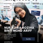


The design effectively utilizes bold typography to establish hierarchy, particularly with the title “UKQT3001-06” and the student’s name prominently displayed. The contrasting colors—dark tones for the text against a lighter background—enhance readability. However, the layout feels somewhat congested, potentially distracting from key information.
The image of the student adds a personal touch but competes for attention with the text. A better balance between text and imagery would improve visual flow. The inclusion of a blue accent box for “ExCEL” provides an element of contrast and draws the eye.
While the overall aesthetic is coherent, simplifying some text elements might enhance clarity. In summary, the design demonstrates solid foundational principles but could benefit from improved balance and composition to elevate its visual effectiveness.