First Submission
by SITI NUR ASHIQIN BINTI AZMAN | 23 Apr 2025 | SHPP3303 2425-2, SHPP3303 2425-2 Group 20 | 6 comments

6 Comments
Submit a Comment Cancel reply
You must be logged in to post a comment.
Class / Group
- Class 2026 semester 1
- Class 2026 semester 1 Group 1
- Class 2026 semester 1 Group 2
- SHPP3303 2425-2
- SHPP3303 2425-2 Group 1
- SHPP3303 2425-2 Group 10
- SHPP3303 2425-2 Group 11
- SHPP3303 2425-2 Group 12
- SHPP3303 2425-2 Group 13
- SHPP3303 2425-2 Group 14
- SHPP3303 2425-2 Group 16
- SHPP3303 2425-2 Group 17
- SHPP3303 2425-2 Group 18
- SHPP3303 2425-2 Group 19
- SHPP3303 2425-2 Group 2
- SHPP3303 2425-2 Group 20
- SHPP3303 2425-2 Group 21
- SHPP3303 2425-2 Group 22
- SHPP3303 2425-2 Group 24
- SHPP3303 2425-2 Group 25
- SHPP3303 2425-2 Group 26
- SHPP3303 2425-2 Group 27
- SHPP3303 2425-2 Group 3
- SHPP3303 2425-2 Group 4
- SHPP3303 2425-2 Group 5
- SHPP3303 2425-2 Group 6
- SHPP3303 2425-2 Group 7
- SHPP3303 2425-2 Group 8
- SHPP3303 2425-2 Group 9
- Test
- Test Group 1
Posts Calendar
 Extra Submission
 Extra Submission
 Extra Submission
 Extra Submission
 Work- Life Balance Infographic
 Third Submission
 Second Submission
 Second Submission
 Third Submission
 Infographic Nur Irsalina Saiza
 (Latest) Assignment 1 Infographic_Nurul Ain binti Mohd Rosdi
 Assignment 1 Infographic _ Nurul Ain binti Mohd Rosdi
 Extra Submission
 Extra Submission
 Second Submission
 Third Submission
 Second Submission
 Second Submission
 Second Submission
 Third Submission
 Extra Submission
 Second Submission
 Extra Submission
 Third Submission
 Second Submission
 First Submission
 First Submission
 First Submission
 First Submission
 First Submission
 First Submission
 First Submission
 First Submission
 First Submission
 First Submission
 Rear Naked Choke
 First Submission
 First Submission
 First Submission
 First Submission
 First Submission
 First Submission
 First Submission
 First Submission
 First Submission
 First Submission
 First Submission
 Testing1
 First Submission
 First Submission


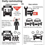
Could you comment on the colour choice.
The color choice is quite vibrant, which can be eye-catching, but it may lack sufficient contrast for readability. Consider balancing the colors to enhance the overall harmony of the design. A more subdued palette could improve the masculine appeal while maintaining visual interest. Experimenting with different combinations could yield a more effective design. What do you think about trying a more muted color scheme?
Could you suggest some muted colour scheme that complements the original design?
Great question! For a muted color scheme that complements your original design, consider using soft earth tones like sage green, muted terracotta, and warm beige. These colors create a calming effect and maintain readability. Additionally, pairing these with a soft gray for backgrounds can enhance the overall aesthetic without overwhelming the viewer. Remember, balance is key!
Could you provide the RGB code for the colours mentioned?
The RGB codes for the colors mentioned are as follows:
1. #FF725E – RGB(255, 114, 94)
2. #FFDD33 – RGB(255, 221, 51)
Feel free to explore other combinations for a more dynamic design!