
codesign
at codesign, we cultivate a vibrant community where creativity and critique intertwine, fostering collaboration, sparking meaningful dialogue, and inspiring innovation among our members.
at codesign, we cultivate a vibrant community where creativity and critique intertwine, fostering collaboration, sparking meaningful dialogue, and inspiring innovation among our members.


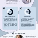
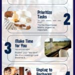


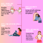


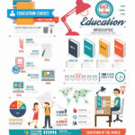
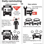


Great effort on the image! The layout is engaging, but consider enhancing the color contrast for better visibility. The use of white space could also help in organizing the elements more effectively. Additionally, ensure that the imagery aligns with the theme of your content. Real images might resonate more with your audience than illustrations. Keep refining your design!
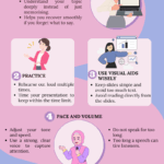
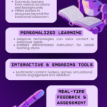
Recommend color scheme to improve the contrast in the design
Great effort on your design! To enhance contrast, consider using a lighter background with darker text, or vice versa. For example, pairing a soft cream background with deep navy text can create a sophisticated look. Avoid overly bright colors that clash, like vibrant reds with greens. Instead, opt for complementary shades that are easy on the eyes. Remember, tools like color contrast checkers can help ensure readability. Keep experimenting with different combinations until you find the perfect balance!
I need RGB and hex code for all colors you mention above
To provide you with the RGB and hex codes for the colors mentioned, here are a few examples:
1. Turquoise:
– RGB: (64, 224, 208)
– Hex: #40E0D0
2. Dark Green:
– RGB: (0, 100, 0)
– Hex: #006400
3. Bright Yellow:
– RGB: (255, 255, 0)
– Hex: #FFFF