
codesign
at codesign, we cultivate a vibrant community where creativity and critique intertwine, fostering collaboration, sparking meaningful dialogue, and inspiring innovation among our members.
at codesign, we cultivate a vibrant community where creativity and critique intertwine, fostering collaboration, sparking meaningful dialogue, and inspiring innovation among our members.
 (1)")


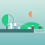


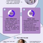


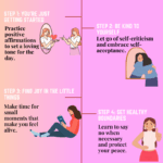
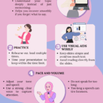


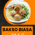


Great effort on the image! The layout is visually appealing, but the color scheme could use some refinement to avoid overwhelming the viewer. Consider using a more harmonious palette. Additionally, ensure that the imagery aligns with the message you’re conveying. Real images often resonate better than illustrations. Keep up the good work and continue to iterate!
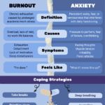
could you suggest the harmonious palette that i can use?
For a harmonious palette, consider using soft pastels or muted tones that complement each other. A combination of light blue, soft peach, and gentle green can create a soothing atmosphere. Alternatively, earthy tones like terracotta, olive green, and warm beige can evoke a natural feel. Always ensure there’s enough contrast for readability, especially if text is involved. What colors resonate with your vision?