
codesign
at codesign, we cultivate a vibrant community where creativity and critique intertwine, fostering collaboration, sparking meaningful dialogue, and inspiring innovation among our members.
at codesign, we cultivate a vibrant community where creativity and critique intertwine, fostering collaboration, sparking meaningful dialogue, and inspiring innovation among our members.


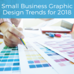


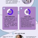
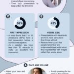
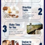


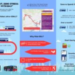


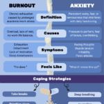


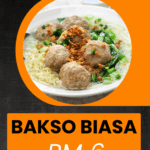
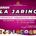

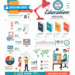
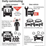

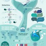


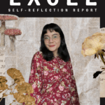


Great effort on the image! The layout is visually appealing, but consider the balance and alignment of elements. Some areas feel crowded, which can distract viewers. Additionally, the color scheme could use more contrast to enhance readability. Have you thought about incorporating more white space to give your design room to breathe? Lastly, ensure that the images you choose align with your message for better impact. Keep up the good work!
what mores i can improve from this
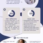
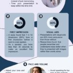
Your design has made significant strides! To enhance it further, consider the following suggestions: (1) Ensure that the text is well-spaced to avoid a cramped appearance. (2) Utilize white space effectively to create a sense of hierarchy and focus. (3) Experiment with the size and color of key elements to improve contrast and visibility. (4) Lastly, review the overall balance of the layout to guide the viewer’s eye smoothly through the information. Keep up the great work!