[…] and collectibles. We supply all your Van Halen & related merchandise in one convenient place fake yeezys, with wonderful…
codesign
at codesign, we cultivate a vibrant community where creativity and critique intertwine, fostering collaboration, sparking meaningful dialogue, and inspiring innovation among our members.


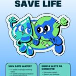
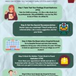
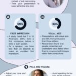

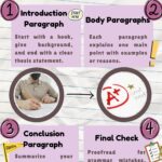
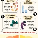

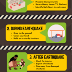
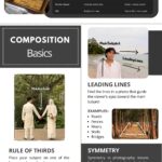

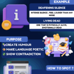



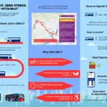
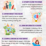


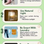

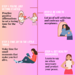
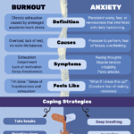

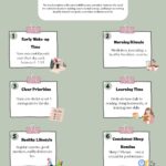
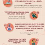
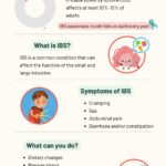
This image effectively communicates the process of applying for a job through a well-structured layout. The use of a pastel color scheme enhances visual appeal and creates a friendly atmosphere. Each step is clearly numbered and accompanied by relevant imagery, establishing a clear visual hierarchy that guides the viewer through the content.
Typography choices are appropriate, with a mix of bold and regular fonts that aid readability. However, the contrast between text and background could be improved in some areas to enhance legibility.
The overall composition maintains balance, with images and text distributed evenly across the design. This provides a cohesive look while avoiding clutter.
In summary, the design demonstrates strong principles of layout and hierarchy, though enhancing contrast and ensuring consistent readability could further improve its effectiveness.
The overall layout is clean and visually well-organized, and the choice of colors creates a soothing and professional tone. However, this assignment required an infographic , not just a poster. While you outlined the steps involved in applying for a job, an effective infographic typically includes data-driven insights or impactful statistics to reinforce the message. For example, incorporating a fact like “X% of job applications fail due to poor CV formatting” would provide valuable context and make the content more persuasive. The cartoon-style visuals particularly the briefcase in the top right corner, do not appear to contribute meaningful value to the message. In terms of originality, there was limited use of self-generated visuals. Including your own photographs, hand-drawn illustrations, or custom digital graphics would have demonstrated a higher level of creative effort and significantly strengthened your work in this area.
improvise my design into infographic
The infographic effectively communicates the four steps to applying for a job, showcasing a clear structure.
**Balance and Layout**: The layout is well-balanced, with distinct sections for each step, allowing for easy navigation. The use of rounded shapes adds a friendly, approachable feel.
**Hierarchy**: The use of numbers and varying font sizes establishes a clear visual hierarchy, guiding the viewer through the steps logically.
**Typography**: The font choices are readable, but varying the font weight or style for headings could enhance distinction between sections further.
**Colour Scheme**: The pastel colour palette is harmonious, but increasing contrast for text against backgrounds would improve readability.
**Imagery**: Relevant images support the content, but ensuring they are consistently styled would enhance cohesion.
Overall, the design is effective, but adjustments in contrast and typography could further elevate its clarity and impact.