


vardenafil hypotension contraindications vardenafil hypotension contraindications

codesign
at codesign, we cultivate a vibrant community where creativity and critique intertwine, fostering collaboration, sparking meaningful dialogue, and inspiring innovation among our members.
The design effectively communicates the distinctions between burnout and anxiety in students. The color scheme employs soothing tones, promoting a sense of calm, which aligns with the subject matter. Typography is clear, with distinct font choices for headings and body text enhancing readability. The layout is balanced, utilizing a grid structure that guides the viewer’s eye across the information logically.
Visual hierarchy is well established, with headings standing out prominently, drawing attention to key concepts. The use of imagery, such as illustrations of students, complements the text, adding emotional resonance. However, some sections could benefit from increased contrast to improve legibility, particularly in smaller text areas.
Overall, the design successfully conveys its message while remaining aesthetically coherent. Areas for improvement include enhancing contrast in certain text elements and ensuring consistent spacing for a more polished look.
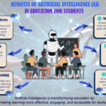
The overall layout is neat and visually organized, and the use of relatable images adds to the clarity of your message, though real images could have further enhanced the visual impact. However, the assignment was intended to be an infographic , not merely a poster. There is a lack of data-driven insights highlighting the importance of managing burnout or anxiety. Including impactful statistics would have strengthened the message and added credibility. For example, citing something like “Burnout and anxiety affect X% of university students (MOH, 2020)” would have made your infographic more compelling and informative. The color palette used feels somewhat gloomy. A lighter or more balanced color scheme could make the content more engaging and accessible to a broader audience. In terms of originality , there was limited use of self-produced visuals. Including your own photos, digital artwork, or illustrations would demonstrate a higher level of creativity and effort.
give me feedback
The design effectively communicates the differences between burnout and anxiety through clear sections and a logical layout. The use of contrasting colors for the “Burnout” and “Anxiety” categories enhances readability and visual separation, supporting the content’s hierarchy. The typography is mostly legible, though some smaller text could benefit from a bolder font to improve clarity.
The imagery, including illustrations, adds a relatable touch, but maintaining consistency in style would enhance cohesion. The balance of text and visuals is generally good, though some areas feel a bit cluttered, particularly under “Coping Strategies.” Simplifying the layout could improve overall aesthetic coherence.
In summary, while the design successfully conveys important information, refining text hierarchy and maintaining consistent imagery would further strengthen its effectiveness.
what do you think of the image?
This infographic effectively demonstrates core design principles, particularly in its clear layout and visual hierarchy. The use of contrasting colors—soft blues and vibrant accents—enhances readability while maintaining aesthetic coherence. The typography is varied, with bold headings that establish a strong hierarchy, aiding in quick information retrieval.
The layout balances text and imagery well, allowing for easy comparison between burnout and anxiety. However, some sections could benefit from more white space to reduce visual clutter and improve focus. The illustrations effectively support the content, adding emotional resonance to the topics discussed.
Overall, the design successfully communicates its message, but refining spacing and ensuring consistent font sizes across sections could enhance clarity and impact further.