


saxenda injection directions saxenda injection directions
GROUP TASK_KUSHALI_SHARMILA, POI SEE

1 Comment
Submit a Comment
You must be logged in to post a comment.

at codesign, we cultivate a vibrant community where creativity and critique intertwine, fostering collaboration, sparking meaningful dialogue, and inspiring innovation among our members.
You must be logged in to post a comment.
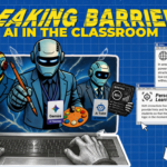
The design effectively communicates the benefits of AI in education through clear organization and visual appeal.
The color scheme is harmonious, utilizing a combination of soft blues and whites that evoke a sense of technology and clarity. Typography is consistent; the headings are bold and readable, while the body text is clearly legible, enhancing overall readability.
The layout demonstrates good balance, with a symmetrical arrangement of text boxes and imagery that guides the viewer’s eye across the design. Visual hierarchy is established through varying font sizes and the placement of the robot illustration, which serves as a focal point.
However, the contrast between text and background could be improved in some areas to enhance visibility. Additionally, the use of icons is effective but could be better integrated to create a more cohesive look. Overall, the design successfully meets educational objectives while inviting engagement.