


vardenafil hypotension contraindications vardenafil hypotension contraindications

codesign
at codesign, we cultivate a vibrant community where creativity and critique intertwine, fostering collaboration, sparking meaningful dialogue, and inspiring innovation among our members.
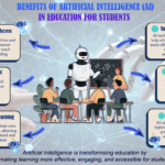
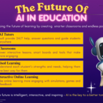
The design effectively employs a vibrant color scheme, featuring pastel hues that enhance visual appeal while maintaining readability. The typography varies, with bold headers and clear body text, which supports hierarchy and guides the reader through the steps. Each section is visually distinct, using shapes like rectangles and arrows to create a sense of flow and direction.
The layout is balanced, with a mix of imagery and text that keeps the viewer engaged. The contrast between the textured backgrounds and the text ensures legibility. Moreover, the inclusion of images of diverse individuals adds relatability and reinforces the content’s practical application.
However, there could be improvement in the consistency of font styles and sizes across sections for better cohesion. Overall, the piece successfully communicates its message, balancing instructional clarity with aesthetic charm.
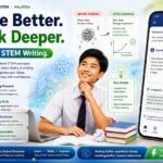
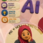
Great choice of colors! your layout is clean, and the visuals you selected are relatable and support the overall message well. However, there is room for improvement in a few areas. The image used in Step 3 appears to be slightly lower in quality compared to the others. Consider replacing it with a higher-resolution version to maintain consistency and visual appeal across the infographic. In terms of content, the statistical fact you included “In 2025, 1.53 billion people spoke English” does not clearly support your message. The statistic lacks a direct connection to the purpose of your infographic. Instead, consider using data that highlights the importance of improving English skills , such as: “Over 70% of global employers consider English proficiency a key hiring criterion.” This type of statistic provides relevance and reinforces the message you are trying to communicate.
interesting design yes
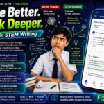
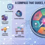
The design effectively utilizes a playful color scheme and a mix of textures to engage the viewer, enhancing aesthetic coherence. The typography is varied, which helps establish a visual hierarchy; however, some font choices could improve readability, particularly for smaller text. The layout demonstrates good balance with an organized flow from one step to another, guiding the reader through the content. The use of imagery is relevant, supporting the text and reinforcing the message. However, there could be more contrast between text and background in certain areas to ensure clarity. Overall, the design successfully communicates its intent, but refining typography and increasing contrast in specific sections would enhance its effectiveness.