[…] and collectibles. We supply all your Van Halen & related merchandise in one convenient place fake yeezys, with wonderful…
codesign
at codesign, we cultivate a vibrant community where creativity and critique intertwine, fostering collaboration, sparking meaningful dialogue, and inspiring innovation among our members.

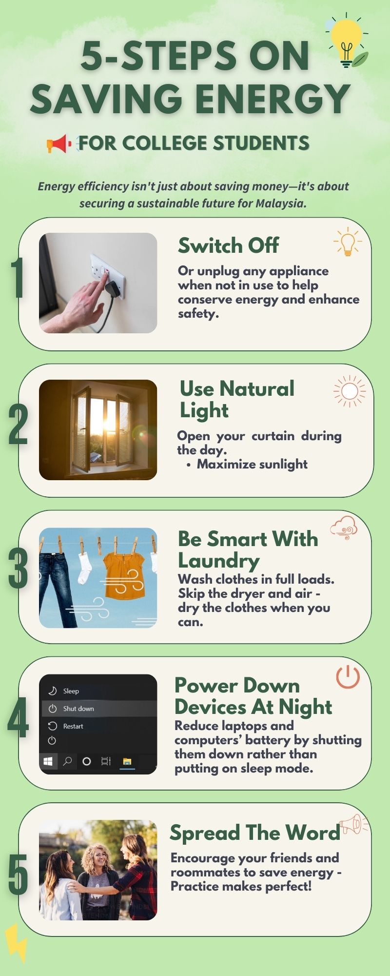



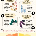

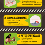
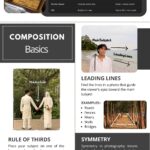

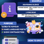


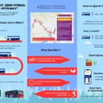
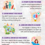


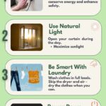
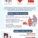
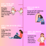
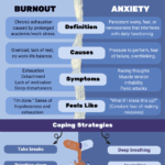

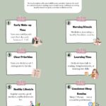
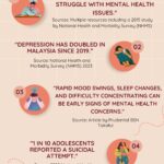
The design effectively communicates energy-saving tips for college students through a cohesive layout and engaging visuals. The color scheme, featuring soft greens and warm accents, creates a friendly and inviting atmosphere, enhancing aesthetic coherence.
Typography is clear, with a mix of bold headings and readable body text, which facilitates easy navigation and comprehension. The hierarchy is well-established, guiding the viewer’s eye from the main title to each step, ensuring that key messages stand out.
Imagery complements the text, providing visual context and reinforcing the tips presented. The layout maintains balance, with a consistent structure across each section, though increasing contrast between text and background in certain areas could improve readability.
Overall, the design is effective but could benefit from enhancements in contrast and potentially more varied typography to further enrich visual interest.
The overall layout is neat and visually organized , and the use of relatable images enhances the clarity of your message— well done! However, the infographic lacks data-driven insights that highlight the importance of saving energy. Since this assignment was meant to be an infographic (not just a poster), including impactful statistics would provide stronger context and increase its persuasive power. For example, a statement like “Using less electricity can result in X% cleaner air” would make the message more compelling. The color scheme is acceptable but could be explored further. In terms of originality , there was limited use of self-produced visuals. Adding your own photos, drawings, or digital artwork would demonstrate a higher level of creativity and effort.
Can you comment on my colour, layout, as well as overall design whether it is sequential or organized?
The design effectively utilizes a harmonious color scheme with soft greens that evoke a sense of nature and sustainability, which aligns well with the theme of energy conservation. The layout is organized sequentially, presenting five actionable steps in a clear, vertical arrangement that enhances readability. Each section is visually distinct, utilizing imagery that complements the text, thereby reinforcing the message.
The typography is approachable, with a friendly sans-serif font that maintains good readability. However, varying font weights could enhance visual hierarchy, making key points stand out more effectively. The contrast between text and background is adequate, ensuring legibility.
Overall, the design demonstrates a solid understanding of balance and composition, making it accessible and engaging for college students. To improve, consider refining the visual hierarchy and experimenting with font weights to better emphasize important information.