[…] and collectibles. We supply all your Van Halen & related merchandise in one convenient place fake yeezys, with wonderful…
codesign
at codesign, we cultivate a vibrant community where creativity and critique intertwine, fostering collaboration, sparking meaningful dialogue, and inspiring innovation among our members.

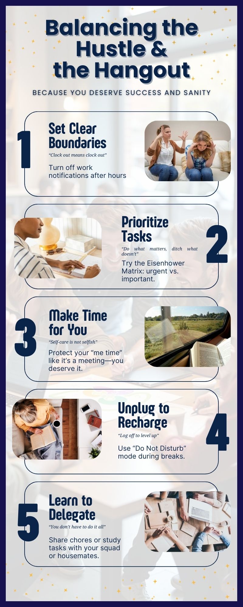




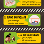
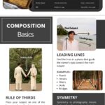

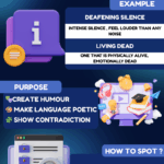


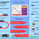
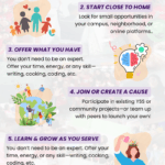


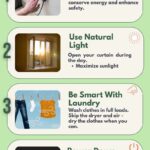
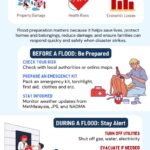
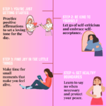
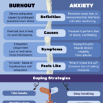

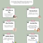
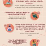
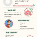
The design effectively demonstrates core principles of graphic design. The color scheme, featuring a rich purple background with white and blue text, creates a strong visual contrast that enhances readability. The use of bold typography for headings, such as “Set Clear Boundaries,” establishes a clear hierarchy, guiding the viewer’s eye through the content.
The layout is well-balanced, with each section separated by images, which adds visual interest without overwhelming the text. However, the imagery could be better integrated with the text to enhance coherence. The icons and illustrations provide a nice texture, making the design feel more inviting.
Overall, the design is aesthetically coherent and communicates its message effectively. For improvement, consider refining the integration of text and images to strengthen the visual flow and ensure that all elements align with the intended conceptual framework.
The overall layout is neat and visually organized , and the visuals used are relevant to the theme of work-life balance. However, this assignment was intended to be an infographic , not just a poster. While you presented clear steps related to the importance of work-life balance, the infographic format typically includes data-driven insights or impactful statistics to strengthen the message. For example, a statement like “Individuals with a healthy work-life balance are X% more likely to succeed in their careers” would provide stronger context and enhance the effectiveness of your message. The color combination works well, but would works better wothout that low-opacity background, consider using a different background. Also, some text elements are too small e.g., “Do what metters…”and could be increased by 2–3 points for better visibility. Regarding originality , there was limited use of self-produced visuals. Including your own photos, drawings, or digital artwork would reflect more creative effort and improve your score in that area.
which part I could improve in my design?
The design demonstrates a clear structure and thematic coherence, but there are areas for improvement.
The color scheme, while visually appealing with a dark background and light text, could benefit from higher contrast to enhance readability, especially for the smaller text. The typography is bold and engaging, yet the mix of fonts could be more harmonized; consider using complementary typefaces that maintain consistency in style.
The layout is generally well-organized, but the balance could improve by ensuring equal spacing between elements to create a more uniform appearance. Additionally, visual hierarchy could be strengthened by varying font sizes more distinctly, especially for headings versus body text.
Finally, while the imagery adds interest, ensure that any visuals used are relevant and support the text effectively, avoiding distraction. Overall, these adjustments could enhance clarity and impact.