[…] and collectibles. We supply all your Van Halen & related merchandise in one convenient place fake yeezys, with wonderful…
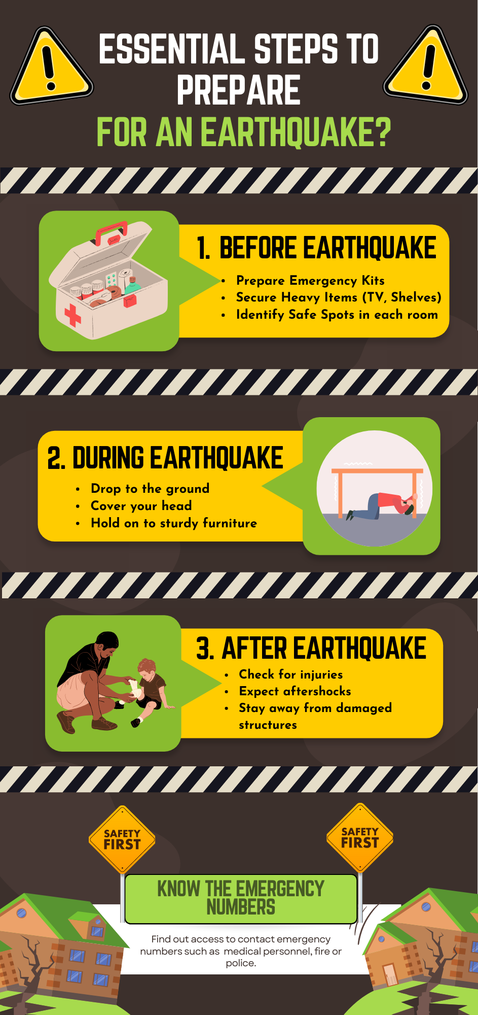
Essential Steps to prepare for an earthquake

4 Comments
Submit a Comment
You must be logged in to post a comment.
at codesign, we cultivate a vibrant community where creativity and critique intertwine, fostering collaboration, sparking meaningful dialogue, and inspiring innovation among our members.

You must be logged in to post a comment.
The design effectively communicates essential earthquake preparedness steps through clear layout and visual hierarchy. The use of a bold color scheme, primarily yellow and black, provides high visibility and conveys urgency. Each section is neatly organized with headings, making it easy for viewers to follow.
Typography is varied with distinct fonts for headings and body text, enhancing readability, although some font choices may benefit from increased contrast against the background. The layout maintains balance by distributing visual elements evenly across the sections, while illustrations add context and support understanding.
Overall, the design is coherent and engaging, successfully guiding the viewer through critical information. However, improving contrast in typography and ensuring consistency in icon styles could enhance its overall effectiveness.
Great choice of colors, a neat layout, and a relatable selection of images. However, using real images could offer a stronger emotional connection and enhance the impact of your earthquake awareness message . Real-life visuals tend to evoke a greater sense of urgency and relevance, especially in topics involving safety and disaster preparedness. Additionally, there seems to be a misunderstanding of the task requirements . This assignment called for an infographic , not just a poster. While you have outlined steps for earthquake preparation, an effective infographic typically includes supporting data or impactful statistics . For example, citing a statistic such as “In 2023, over 25,000 people were displaced due to earthquakes in [specific region] ” would provide clearer context and reinforce the importance of the information. In terms of originality, the work showed limited use of self-produced visuals . Adding your own photos, drawings, or digital illustrations would not only enhance the uniqueness of your project but also significantly improve your score in that area.
suggest for design improvement
This design effectively communicates essential earthquake preparedness steps but can benefit from several improvements.
1. **Colour Scheme and Harmony**: The use of yellow and black for warnings is effective, but the background colors might clash with the text. Consider a more muted background to enhance readability.
2. **Typography**: While the fonts are bold and attention-grabbing, some text, particularly in the “During Earthquake” section, may be too small for quick reading. Increasing font size for key points could enhance legibility.
3. **Layout**: The sections are well-defined, but visual balance could be improved by ensuring equal spacing between elements. This would create a more cohesive look.
4. **Contrast**: Ensuring high contrast between text and background in all sections will enhance readability and visual impact.
Overall, emphasizing clarity through these adjustments will improve effectiveness and ensure the information is easily accessible.