


mobic medication for pain mobic medication for pain
Five steps on how to access mental health help from Hospital Permai

4 Comments
Submit a Comment
You must be logged in to post a comment.

at codesign, we cultivate a vibrant community where creativity and critique intertwine, fostering collaboration, sparking meaningful dialogue, and inspiring innovation among our members.
You must be logged in to post a comment.
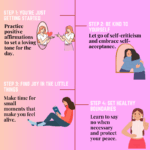
The design effectively employs a playful theme to convey mental health guidance, utilizing a color scheme of soft pastels that promotes a calming atmosphere. The typography is friendly and approachable, with clear headings that enhance readability. The layout is well-organized, with each step distinctly separated, creating a logical flow that guides the user through the process.
Contrast is effectively used, with dark text on light backgrounds, ensuring easy readability. Visual hierarchy is established through varying font sizes and weights, emphasizing key points while maintaining a cohesive aesthetic. The imagery, including illustrations of people and icons, adds a relatable touch to the content, enhancing engagement.
However, the design could benefit from more consistent spacing between elements to improve balance further. Additionally, simplifying some language could enhance clarity for a broader audience. Overall, it successfully communicates its intent while adhering to fundamental design principles.
The overall layout is neat and visually organized, which is commendable. However, this assignment was expected to be an infographic , not just a poster. While you included steps related to seeking help for mental health, an effective infographic typically incorporates data-driven insights or impactful statistics to support and strengthen the message. For example, including a statistic like “Suicidal cases in Malaysia have increased by X% in recent years” would have added context and made your message more compelling. The color combination feels a bit gloomy, which may not be the most effective choice for promoting mental health awareness. A lighter, plain background— rather than the “wrinkled paper” texture—would improve clarity. Also, a more neutral and inclusive color palette could broaden the message’s reach and enhance engagement. Some text elements (e.g., “Here’s how to order…” ) are difficult to read due to low contrast, which affects accessibility. While the cartoon- style visuals are approachable, they may not convey the emotional depth or seriousness of the topic. Consider using more expressive and relevant imagery that resonates better with the subject matter of mental health. In terms of originality , there was limited use of self-produced visuals. Incorporating your own photos, illustrations, or digital artwork would have demonstrated greater creative effort and positively impacted your score.
Recommend color scheme to improve the contrast in the design
To enhance contrast in the design, consider a color scheme that utilizes complementary colors. For example, if the background is a soft green, pairing it with a darker shade like deep navy or charcoal for text can improve readability and visual hierarchy.
Additionally, implementing a bolder accent color, such as a bright orange or yellow for headings or key points, can draw attention effectively while maintaining harmony.
Ensure that the text is legible against the background by adjusting font weights and sizes accordingly, creating a clear visual distinction between different sections.
This approach will not only improve readability but also create a more engaging aesthetic by emphasizing important information and guiding the viewer’s eye through the content.