


[…] and collectibles. We supply all your Van Halen & related merchandise in one convenient place fake yeezys, with wonderful…

codesign
at codesign, we cultivate a vibrant community where creativity and critique intertwine, fostering collaboration, sparking meaningful dialogue, and inspiring innovation among our members.
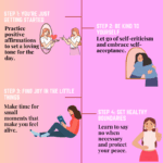
The design effectively employs a soft pink color scheme, creating a warm and inviting atmosphere that aligns with the theme of self-love. The typography is a mix of playful and clear fonts, enhancing readability while maintaining aesthetic coherence. The layout is generally balanced, with a central column for steps and illustrations that guide the viewer’s eye through the content.
However, the visual hierarchy could be improved; the step titles are less prominent than the main title, which might confuse viewers. The contrast between text and background is adequate, but some steps may benefit from bolder text to enhance visibility. Overall, the imagery is engaging, supporting the message well, though varying the textures could add more depth. The design effectively communicates its message but could enhance clarity and emphasis on key points.
The overall layout is neat and visually organized. However, there appears to be some misunderstanding of the task requirements. This assignment was meant to be an infographic , not just a poster. While you did present steps related to self-love, the infographic format typically includes data-driven insights or impactful statistics to support the message. For example, instead of general statements, including a fact such as “suicidal cases in Malaysia have increased by X% in recent years” would provide stronger context and make the content more compelling. The use of pink as the dominant color may unintentionally limit the appeal of your message. While pink is often associated with femininity, self-love is a universal need that transcends gender. A more neutral or inclusive color palette might broaden the impact of your message and engage a wider audience more effectively. Some texts are hard to read, lacking contrast. The cartoon-style visuals, although approachable, may not convey the emotional depth or seriousness of the issue. Consider using more powerful and expressive imagery that resonates with the emotional and mental health aspects of self-love. Regarding originality, there was limited use of self-produced visuals. Incorporating your own photos, drawings, or digital artwork would demonstrate a higher level of creative effort and enhance your score in that area.
which part I could improve in my design?
The design effectively communicates the theme of self-love through its cheerful color palette and engaging imagery. However, there are areas for improvement:
1. **Typography**: The font choices vary significantly in style, which may disrupt readability. Consider using a more consistent font family to enhance cohesion.
2. **Layout**: While the vertical alignment of steps is clear, the horizontal lines separating sections might benefit from more visual weight or color to create better distinction and guide the viewer’s eye.
3. **Contrast**: Some text, particularly in darker colors, could be difficult to read against the pink background. Ensuring higher contrast will improve legibility.
4. **Visual Hierarchy**: The most crucial messages can be emphasized with size or color to draw attention, ensuring that viewers can quickly grasp the content’s organization.
Overall, refining these elements could enhance clarity and visual appeal.