


[…] and collectibles. We supply all your Van Halen & related merchandise in one convenient place fake yeezys, with wonderful…
HOW TO DELIVER A GOOD PRESENTATION

4 Comments
Submit a Comment
You must be logged in to post a comment.

at codesign, we cultivate a vibrant community where creativity and critique intertwine, fostering collaboration, sparking meaningful dialogue, and inspiring innovation among our members.
You must be logged in to post a comment.
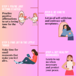
The design effectively communicates the topic of delivering a good presentation through several key elements.
The color scheme employs soft, muted tones that create a calm and professional atmosphere, enhancing aesthetic coherence. The use of imagery, featuring circular frames for the portraits, adds visual interest and contributes to a friendly tone.
Typography is clear and readable, with a bold font for headings that establishes a strong hierarchy, making it easy to navigate the content. However, the body text could benefit from increased contrast against the background for improved readability.
The layout is well-balanced, with a clear flow from one section to another, ensuring that each point is distinct while maintaining visual harmony.
Overall, the design successfully conveys its message but could enhance text contrast for better accessibility.
The overall layout is neat and visually organized. There is also data-driven insights or impactful statistics to support the message although for Americans. As for the rest your design is great! However, regarding originality, there was limited use of self-produced visuals. Incorporating your own photos, drawings, or digital artwork would demonstrate a higher level of creative effort and enhance your score in that area.
thank you for all the comment
The design effectively utilizes a harmonious color scheme with soft, muted tones that create a visually appealing backdrop. The typography is clear and bold, enhancing readability, especially for headings. However, varying font sizes for subheadings could improve visual hierarchy.
The layout demonstrates balance, with images strategically placed to support textual content. The circular frames around the images add a dynamic touch but may disrupt the flow if not spaced evenly.
Contrast is well managed; the text stands out against the background, ensuring legibility. However, the percentage figures could benefit from bolder representation to draw immediate attention.
Overall, the design is cohesive and informative, but slight adjustments in typography and spacing could enhance its effectiveness further, making the information more accessible and engaging for the audience.