[…] and collectibles. We supply all your Van Halen & related merchandise in one convenient place fake yeezys, with wonderful…
codesign
at codesign, we cultivate a vibrant community where creativity and critique intertwine, fostering collaboration, sparking meaningful dialogue, and inspiring innovation among our members.


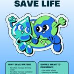
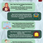
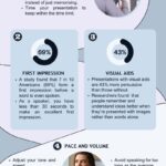
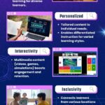
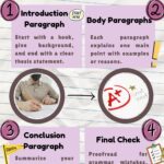
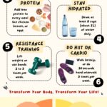

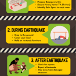
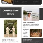




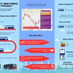
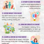


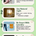

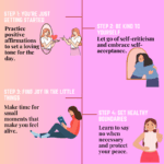
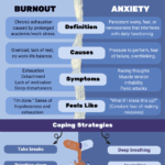

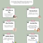
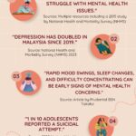
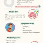
The design effectively employs a light color scheme that promotes a sense of positivity and approachability, enhancing aesthetic coherence. The use of playful typography adds a friendly tone, although the readability could be improved by ensuring consistent font weight across headings and body text.
The layout is generally well-balanced, with a clear visual hierarchy established through numbering and section grouping. However, the composition could benefit from more consistent spacing between elements to enhance flow.
Imagery of food and exercise equipment provides visual support for the text, but the contrast between background and text in some areas may hinder readability. Overall, while the design communicates its message effectively, attention to typography and spacing could elevate its impact further.
The overall layout is neat and visually organized, with relatable images that effectively complement the message. The choice of colors is also pleasing and helps in conveying the message. However, this assignment was meant to be an infographic, not just a poster. Infographics should include data-driven insights that strengthen the message. For example, incorporating a statistic like “Heart disease has become one of the leading causes of death in Malaysia due to poor lifestyle choices” would provide stronger context and make the content more compelling. Regarding originality, there was limited use of self-produced visuals. Incorporating your own photos, drawings, or digital artwork would showcase a higher level of creativity and effort, ultimately enhancing your score in that area.
give me more design improvement
This design presents a clear concept but could benefit from several improvements.
The color scheme is cohesive, yet introducing more contrasting colors could enhance visual hierarchy, making key points stand out more effectively. Typography varies, but some font choices compromise readability, particularly in smaller texts; opt for simpler fonts for clarity.
The layout demonstrates a logical progression, but the composition appears slightly cluttered. Consider increasing white space to create balance and guide the viewer’s eye.
Imagery is relevant but could be better integrated into the overall aesthetic; ensure images align stylistically to maintain coherence. Additionally, the hierarchy could be reinforced through size differentiation, making headings more prominent.
Finally, employing consistent iconography across sections could strengthen visual unity. Overall, focusing on these areas will enhance the design’s effectiveness and engagement.