


[…] and collectibles. We supply all your Van Halen & related merchandise in one convenient place fake yeezys, with wonderful…

codesign
at codesign, we cultivate a vibrant community where creativity and critique intertwine, fostering collaboration, sparking meaningful dialogue, and inspiring innovation among our members.
The design effectively communicates the topic of IBS awareness through a clear layout and engaging visuals. The color scheme, featuring soft pastels with a bold accent, creates a visually appealing harmony that captures attention without overwhelming the viewer. Typography is appropriate, as the headings are bold and readable, while body text maintains clarity, enhancing overall legibility.
The layout demonstrates good balance, with well-defined sections that guide the viewer through the information logically. Visual hierarchy is established through varying font sizes and color contrasts, ensuring key messages stand out. The imagery is relevant and supportive, adding a friendly tone to the educational content.
However, there could be a more consistent use of icons for symptoms and actions to enhance coherence. Additionally, ensuring that the background color does not detract from the text readability would improve accessibility. Overall, the design is strong but could benefit from slight refinements for optimal effectiveness.
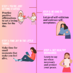
The overall layout is acceptable, and your presentation on saving money is clear, but it could be more impactful. However, this assignment was meant to be an infographic, not just a poster. Infographics should include data-driven insights to enhance the message. For example, a statistic like “In Malaysia, many retirees live below the poverty line due to lack of savings” would provide stronger context and make the content more compelling and informative. The visuals could be improved. The cartoonish images feel somewhat lighthearted and may not reflect the seriousness of the topic. Consider using more appropriate visuals, such as images of people saving money or a clear representation of financial stability. Additionally, the layout could benefit from more consideration in terms of arrangement and shapes of boxes. The design at the bottom of the layout looks less professional and could be more polished. Regarding originality, there was limited use of self- produced visuals. Incorporating your own photos, drawings, or digital artwork would showcase greater creativity and effort, enhancing the overall visual appeal of the piece.
what I can improve
The design effectively communicates the topic of IBS awareness through a clear layout and engaging visuals. The color scheme, featuring a warm background with contrasting text, enhances visibility and draws attention. However, consider refining the hierarchy; the title could be more prominent to emphasize its importance.
Typography is generally readable, but varying font sizes for different sections could improve clarity and engagement. The use of icons adds visual interest, but ensure they are consistently styled to maintain aesthetic coherence.
While the layout is balanced, introducing more whitespace would help reduce clutter and improve readability. Overall, the piece is informative, but refining these elements will enhance both its visual appeal and effectiveness in conveying the message.