


[…] and collectibles. We supply all your Van Halen & related merchandise in one convenient place fake yeezys, with wonderful…

codesign
at codesign, we cultivate a vibrant community where creativity and critique intertwine, fostering collaboration, sparking meaningful dialogue, and inspiring innovation among our members.
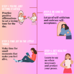
This design effectively communicates the importance of gut health through several key principles.
The color scheme is warm and inviting, using earthy tones that evoke a sense of health and wellness. This aids in aesthetic coherence and creates a calming visual experience.
Typography is clear, with a bold title that grabs attention, while the body text remains readable, though varying font sizes could enhance hierarchy. The layout is well-balanced, with a circular motif that draws the viewer’s eye around the central image and information, creating effective visual flow.
Contrast is utilized well, separating the text from the background, but some text could benefit from bolder colors to improve legibility against the background.
Imagery is relevant and supports the message, though additional diversity in visuals could enhance engagement. Overall, the design is informative and visually appealing, but slight adjustments in typography and contrast could improve clarity and impact.
Your layout is neat and visually well-organized , making it easy to follow the flow of information. However, there seems to be a misinterpretation of the task requirements . This assignment required an infographic , which goes beyond a standard poster by incorporating data-driven content or impactful statistics to support the key message. While you’ve outlined relevant steps related to gut health , enhancing the piece with credible facts or data would significantly strengthen the message. For example, including a statistic like “Poor gut health is linked to serious illnesses (MOH, 2020)” would provide clearer context and a stronger impact. Visual Consistency: One noticeable issue is the inconsistency in image style. Most visuals used were real images , but the inclusion of a cartoon-style visual disrupted the unity. For better consistency, consider replacing it with a standardized 3D image or realistic graphic that aligns with the rest. Creativity & Effort: In terms of originality, the infographic lacked self-produced visual elements . Including your own photos, sketches, or digital artwork would reflect a deeper level of creativity and personal investment in the task.
suggestion to improve my work
Your design effectively communicates essential information about gut health, but there are areas for improvement.
The color scheme has a warm and inviting quality, which aligns well with the topic. However, increasing contrast between text and background would enhance readability, as some sections may blend too much.
The layout is generally balanced, with a central image drawing attention. Yet, consider refining the visual hierarchy; the headings could be more prominent to guide the viewer’s eye more effectively.
Typography is friendly but could benefit from a more consistent font choice to unify the design. Ensure all text is legible, especially smaller captions.
Lastly, while imagery is relevant, ensure all visuals maintain a cohesive style for greater aesthetic coherence. Overall, the design has a solid foundation but refining these elements will enhance clarity and impact.