


[…] finish, it is a surprisingly good rabbit vibrator for the price. The lengthy and in need of it wholesale…
INFOGRAPHIC DAILY ROUTINE FOR SUCCESSFUL PEOPLE

4 Comments
Submit a Comment
You must be logged in to post a comment.

at codesign, we cultivate a vibrant community where creativity and critique intertwine, fostering collaboration, sparking meaningful dialogue, and inspiring innovation among our members.
You must be logged in to post a comment.
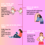
The design effectively utilizes a soft color scheme, predominantly green, which creates a calming and cohesive aesthetic. The typography is clear, with a bold header that grabs attention, although some body text could benefit from slight adjustments in size or weight for improved readability.
The layout demonstrates good balance, with six key points organized in a grid format, ensuring visual harmony. Each section is distinct yet interconnected, promoting a clear hierarchy of information. The use of icons and illustrations adds a playful touch, enhancing engagement.
Contrast is well addressed, as the text stands out against the background, though some areas could use additional differentiation for emphasis. Overall, the design communicates its message effectively, but refining typography and enhancing contrast could further elevate its impact.
Your choice of soothing colors creates a calm visual experience, and the layout is clean. However, the overall design feels a bit too “safe”—you’re encouraged to take more creative risks to make the infographic stand out. Using real images instead of illustrations or icons could strengthen the emotional connection and better reflect the daily routines of successful individuals. Some design choices, such as the paperclips, seem unnecessary and unrelated to the content. They distract from your message rather than enhance it. Also, please note that the use of serif fonts is strongly discouraged in digital or online design for readability reasons. This has been mentioned previously, so do take extra care with typography choices. It also appears there is some confusion about the assignment’s requirements. This task was to create an infographic, not a traditional poster. While you presented steps related to personal success and healthy routines, a proper infographic should include impactful data or statistics. For example: “Heart disease is Malaysia’s top killer, with over 18,000 deaths yearly. Successful people maintain healthy routines to stay focused and productive.” This kind of statistic shows the real-life consequences of an unhealthy lifestyle and helps convince viewers why they should care about making a change. In terms of originality, your visuals appeared to be mostly sourced. Incorporating self-produced content—such as your own photos, sketches, or designs—would boost creativity and improve your score.
thanks , what other improvement I could made bot.
This design effectively communicates the importance of daily routines through clear sections and engaging visuals. The color scheme, featuring soft greens and pastel accents, creates a calming aesthetic that aligns with the content’s focus on well-being.
However, balance could be improved; the text-heavy sections feel crowded compared to the imagery. Increasing whitespace around the text would enhance readability and visual appeal. The typography is generally effective, but varying font sizes for headings and body text could create more visual hierarchy, guiding the viewer’s eye through the information.
The layout is generally organized, but aligning elements more consistently would improve overall cohesion. Additionally, ensuring contrast between text and background could enhance readability, particularly for viewers with visual impairments. Overall, refining these elements would strengthen the design’s impact and clarity.