[…] and collectibles. We supply all your Van Halen & related merchandise in one convenient place fake yeezys, with wonderful…
codesign
at codesign, we cultivate a vibrant community where creativity and critique intertwine, fostering collaboration, sparking meaningful dialogue, and inspiring innovation among our members.

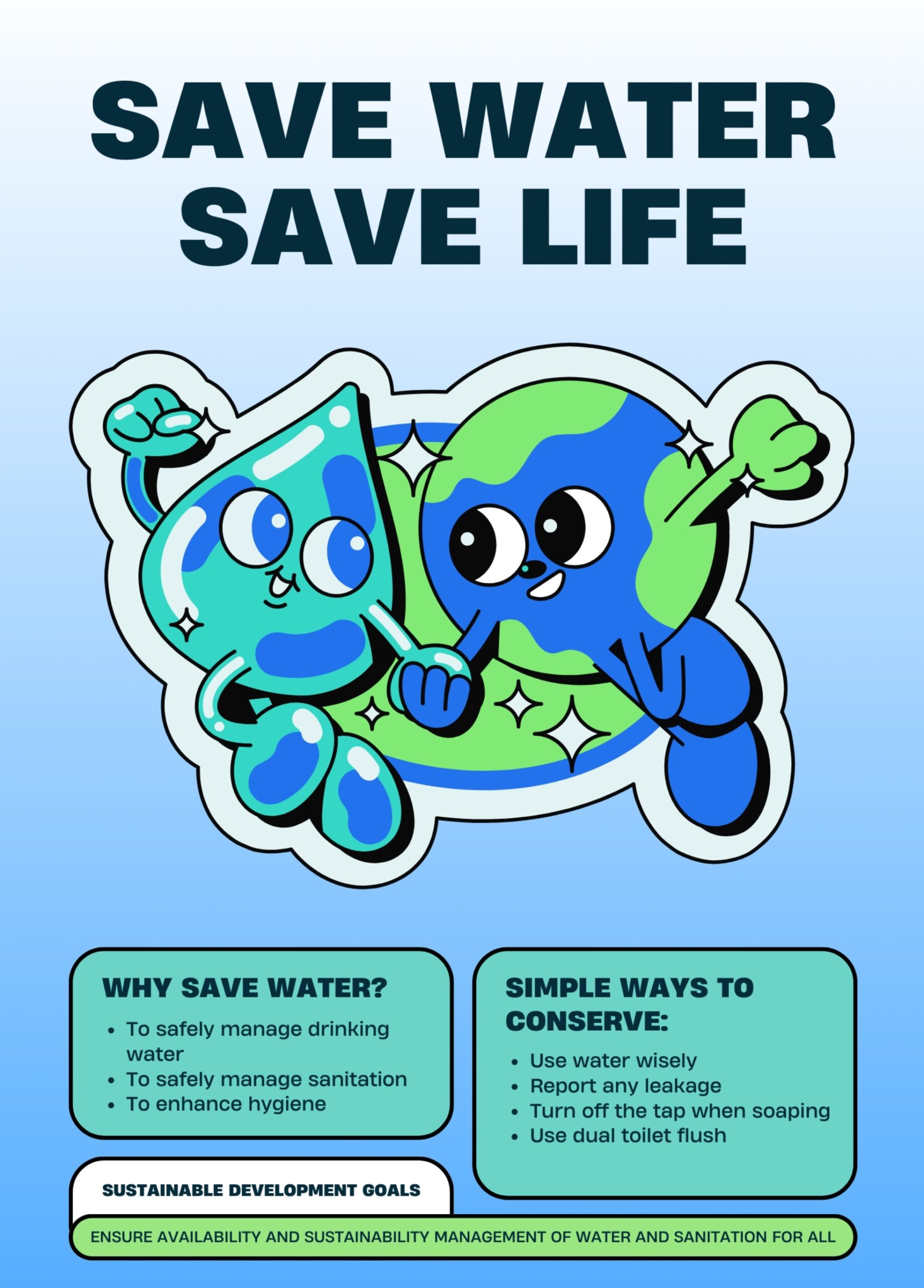









The design effectively communicates its message about water conservation through several key elements.
The color scheme, featuring vibrant blues and greens, creates visual harmony and reinforces the theme of water and the Earth. The typography is bold and legible, with “SAVE WATER SAVE LIFE” prominently placed to establish a strong visual hierarchy. This clarity enhances readability and ensures the message is immediately apparent.
The layout is well-balanced, with imagery of animated water droplets and Earth characters creating a friendly, engaging tone. The use of icons and simple language in the “Simple Ways to Conserve” section supports accessibility, appealing to a broad audience.
However, the design could benefit from improved contrast between text and background in some areas to enhance readability further. Overall, the design successfully combines aesthetic appeal with effective communication, making it a strong educational tool.
The overall layout is neat, but it seems there’s some confusion about the task. This was meant to be an infographic , not just a poster. While you did present steps to save water, you also need to include impactful statistics or facts to highlight the urgency of the issue. For example, instead of general statements, use data like “Malaysia is projected to face severe water scarcity by 2050.” That kind of fact grabs attention and reinforces the message. The cartoon-style image of the water droplet and Earth holding hands feels too light and lacks emotional impact. You should aim for stronger, more powerful visuals that reflect the seriousness of the issue—perhaps a dramatic photo of a dried-up riverbed or a child collecting water from a scarce source. In terms of originality, there was little evidence of self-produced visuals. Including original elements like photos you took yourself would significantly boost your score in that area.
fantastic
The design effectively uses a playful color scheme with blues and greens that harmonize well, representing water and the planet. The large, bold typography for “SAVE WATER SAVE LIFE” is easily readable and creates a strong visual hierarchy, drawing attention immediately.
The layout is balanced, with the whimsical characters of water and Earth centered and complemented by the text below. However, the text sections could benefit from more contrast against the background to enhance readability.
Imagery is engaging, appealing to a younger audience, which aligns with the message’s intent to promote environmental awareness. The visual hierarchy is clear, but the sections labeled “WHY SAVE WATER?” and “SIMPLE WAYS TO CONSERVE” could be more distinct to improve organization.
Overall, the design is effective but could be refined for better text contrast and section differentiation.
How about the layout design arrangement?