


[…] and collectibles. We supply all your Van Halen & related merchandise in one convenient place fake yeezys, with wonderful…
START YOUR SUCCESS JOURNEY AT UTM

7 Comments
Submit a Comment
You must be logged in to post a comment.

at codesign, we cultivate a vibrant community where creativity and critique intertwine, fostering collaboration, sparking meaningful dialogue, and inspiring innovation among our members.
You must be logged in to post a comment.
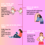
This design effectively communicates its message with a vibrant and inviting color scheme dominated by red, which creates a sense of energy and excitement. The use of large, bold typography for the main message enhances readability and captures attention, although a more contrasting color for the text could improve legibility against the background.
The layout demonstrates a clear hierarchy, guiding the viewer from the headline to the steps for applying. The circular image of the student adds a personal touch, while the inclusion of a QR code encourages interaction. However, the composition could benefit from better balance; the left-heavy design feels slightly uneven.
Overall, the design successfully conveys the university’s welcoming atmosphere, but refining contrast and layout balance could enhance its overall effectiveness. The conceptual intent of encouraging prospective students is clear and well-supported by visual elements.
The overall layout is neat and visually organized. The color choice is also good. However, this assignment was meant to be an infographic, not just a poster. While you did present steps related to applying for UTM, the infographic format typically includes data-driven insights or impactful statistics to support the message. For example, including a fact such as “UTM No.1 Engineering University in Malaysia or 100% UTM Graduate able to secure jobs.” would provide stronger context and make the content more compelling. Regarding originality, there was limited use of self- produced visuals. Incorporating your own photos, drawings, or digital artwork would demonstrate a higher level of creative effort and enhance your score in that area.
Could you suggest some muted colour scheme that complements the original design?
To create a muted color scheme that complements the existing design, consider incorporating soft earth tones and pastel shades. For instance, a palette featuring muted sage green, soft terracotta, pale beige, and light gray can work well. This selection maintains a professional yet inviting aesthetic, enhancing readability and visual comfort.
In terms of design principles, this muted scheme can improve balance and hierarchy, allowing the main message to stand out without overwhelming the viewer. The contrast with the existing vibrant elements will remain effective while providing a more subdued backdrop.
Ensure that typography remains clear and legible against these colors, potentially using a darker shade for text to maintain readability. Overall, this approach would enhance aesthetic coherence while aligning with the educational context.
How to choose good color?
The design effectively employs a warm color palette, primarily featuring deep reds and soft whites, which creates a welcoming and energetic atmosphere. This choice resonates well with the theme of educational success, promoting enthusiasm. The typography is clear, with a bold font for the main message enhancing readability, while smaller text provides necessary details without overwhelming the viewer.
The layout maintains balance, with the text and images well distributed, guiding the viewer’s eye through the content. The circular image of the student adds a personal touch, creating a visual connection. However, the overall composition could benefit from improved contrast between the background and the text, particularly in areas with similar tones.
To enhance aesthetic coherence, consider integrating more consistent spacing around elements. Overall, this design successfully communicates its message while maintaining visual appeal.
The design effectively utilizes a cohesive color scheme dominated by warm reds and neutral tones, creating an inviting atmosphere that resonates with the theme of success. The vibrant colors of the graduates’ gowns provide a strong visual contrast, enhancing the celebratory mood.
Typography is clear, with a strong emphasis on readability; the bold font for the main message draws attention, while the structured numbering of the steps adds clarity to the layout. However, varying font sizes could enhance visual hierarchy further.
The layout is well-balanced, with images and text distributed effectively, ensuring that no element overwhelms another. The use of a circular photo adds a personal touch, enhancing engagement.
While the overall composition is strong, incorporating more negative space could improve focus on key messages. Overall, the design demonstrates solid principles of balance, hierarchy, and coherence, while opportunities for refinement exist.