[…] and collectibles. We supply all your Van Halen & related merchandise in one convenient place fake yeezys, with wonderful…
codesign
at codesign, we cultivate a vibrant community where creativity and critique intertwine, fostering collaboration, sparking meaningful dialogue, and inspiring innovation among our members.

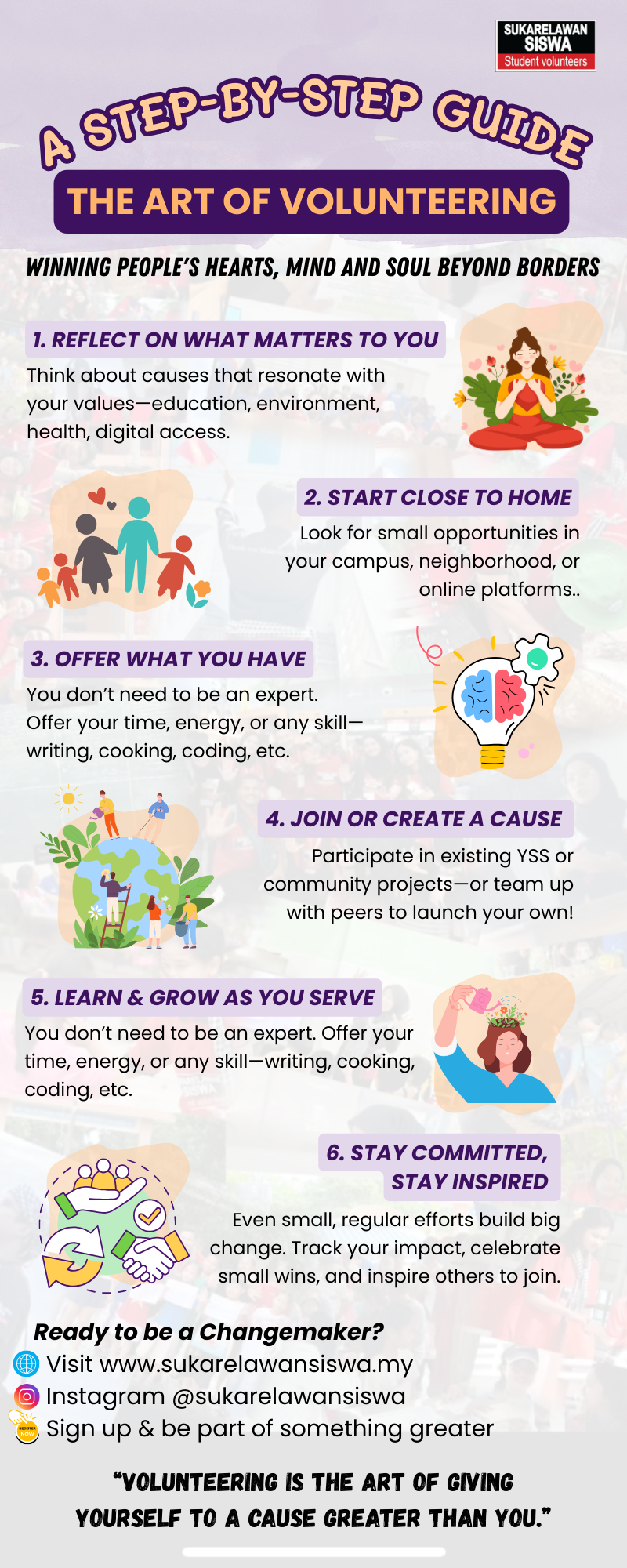




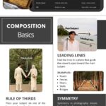

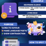


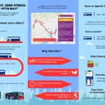
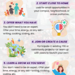
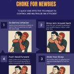


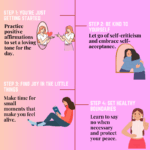
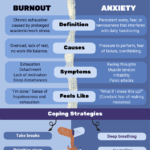

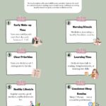
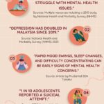
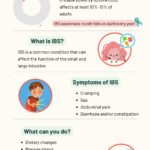
The layout of your work is generally neat and well-structured. However, there seems to be a misinterpretation of the assignment’s requirements. This task called for an infographic , which differs from a general poster in that it typically integrates data-driven content or impactful statistics to support the message. While you included relevant steps about the art of volunteering, the infographic would be more effective with the inclusion of factual statements. For instance, adding a statistic like “Graduates with volunteer experience are more likely to be hired compared to those without (JobStreet)” would offer stronger context and credibility. Design Choices: Color Scheme: The current color combination tends to lean toward a more feminine aesthetic. Consider using a more neutral or diverse palette that appeals broadly across audiences and aligns with the serious and inclusive message of volunteerism. Visual Style: The cartoon-style illustrations do make the content approachable, but they may not fully capture the emotional impact or depth of the volunteer experience. More expressive imagery—such as photos or symbolic graphics—could better convey the seriousness and transformative nature of volunteering. Creativity & Effort: Originality: There is limited use of self-produced visuals. To elevate the creative quality, consider incorporating your own photography, hand-drawn elements , or digitally created graphics . This would reflect a greater personal investment and creativity.
The design effectively communicates a step-by-step guide to volunteering, showcasing a playful yet informative aesthetic.
The color scheme employs soft pastels with vibrant accents, creating a harmonious balance that is visually appealing. The typography varies in size and style, enhancing readability while establishing a clear hierarchy; the main title is bold and engaging, drawing immediate attention.
The layout is well-structured, with distinct sections for each step, allowing for easy navigation. However, the use of decorative elements could be streamlined to prevent visual clutter.
Contrast is generally effective, with a clear separation between text and background, although some smaller text may benefit from increased contrast for better legibility.
Overall, the design demonstrates good technical execution but could improve by refining some visual elements for a cleaner presentation.
what can I improve on.
The design effectively conveys a friendly and inviting theme, aligning with the topic of volunteering. The color scheme is vibrant, using soft pastels that create a warm atmosphere, though some contrast between text and background could be improved for better readability.
Typography choices are playful and engaging, but the hierarchy can be enhanced; the main title stands out well, but subheadings could be more distinct. The layout is organized, presenting information in a clear, step-by-step format that aids navigation.
Visual elements like illustrations complement the text, though ensuring they do not distract from key messages is essential. Overall, while the design is visually appealing, focusing on enhancing contrast, typographic hierarchy, and ensuring imagery supports rather than competes with the text can elevate effectiveness.