


minoxidil women’s results minoxidil women’s results
SELECTING THE RIGHT SONG TO INCORPORATE IN ESL LESSON

4 Comments
Submit a Comment
You must be logged in to post a comment.

at codesign, we cultivate a vibrant community where creativity and critique intertwine, fostering collaboration, sparking meaningful dialogue, and inspiring innovation among our members.
You must be logged in to post a comment.
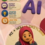
The design effectively adheres to several core principles of graphic design.
The color scheme features a strong contrast between dark and light elements, enhancing readability. The orange accents provide a vibrant contrast against the dark background, drawing attention to key headings.
Typography is clear, with a mix of sans-serif fonts that maintain legibility across various sections. The hierarchy is well-defined, with larger font sizes for headings, ensuring the viewer can navigate the content easily.
The layout is balanced, using a grid structure that organizes information logically. Visual elements, like images and icons, complement the text and create engagement.
However, the overall aesthetic could benefit from more white space to prevent visual clutter. Additionally, incorporating varied imagery could enhance conceptual intent, making the design more dynamic and relatable for the target audience. Overall, the design is effective but could improve in visual breathing space and diverse imagery.
You’ve done a great job presenting relevant content with a strong color combination and well-chosen visuals that align well with the message. The use of facts helps to strengthen the impact of the infographic—well done on integrating those effectively. One area for improvement is the amount of text used. Infographics typically rely more on concise wording and visual storytelling , so try to streamline your text into shorter, impactful phrases or keywords. In terms of originality , while the layout and presentation are effective, the use of self-produced visuals was limited . Incorporating your own photographs, illustrations, or digital artwork would demonstrate more creative initiative and could further boost your score in this area.
summaries my design into point
The design effectively employs several core principles:
1. **Balance**: The layout displays a symmetrical structure, with text and images evenly distributed, enhancing visual stability.
2. **Hierarchy**: Key information is prioritized through font size and color (e.g., bold headings), guiding the viewer’s attention fluidly from one section to another.
3. **Readability**: Typography is clear and legible, with contrasting colors enhancing text visibility against the background, aiding comprehension.
4. **Aesthetic Coherence**: The color scheme of dark backgrounds with vibrant accents creates an engaging visual experience, appealing to the target audience.
5. **Imagery**: Relevant images support the text, providing context and reinforcing the message without overwhelming the content.
Areas for improvement could include ensuring consistent margins for a tidier appearance and possibly varying font styles to add more visual interest. Overall, the design is effective in conveying educational content engagingly.