cialis 5mg generic cialis 5mg generic
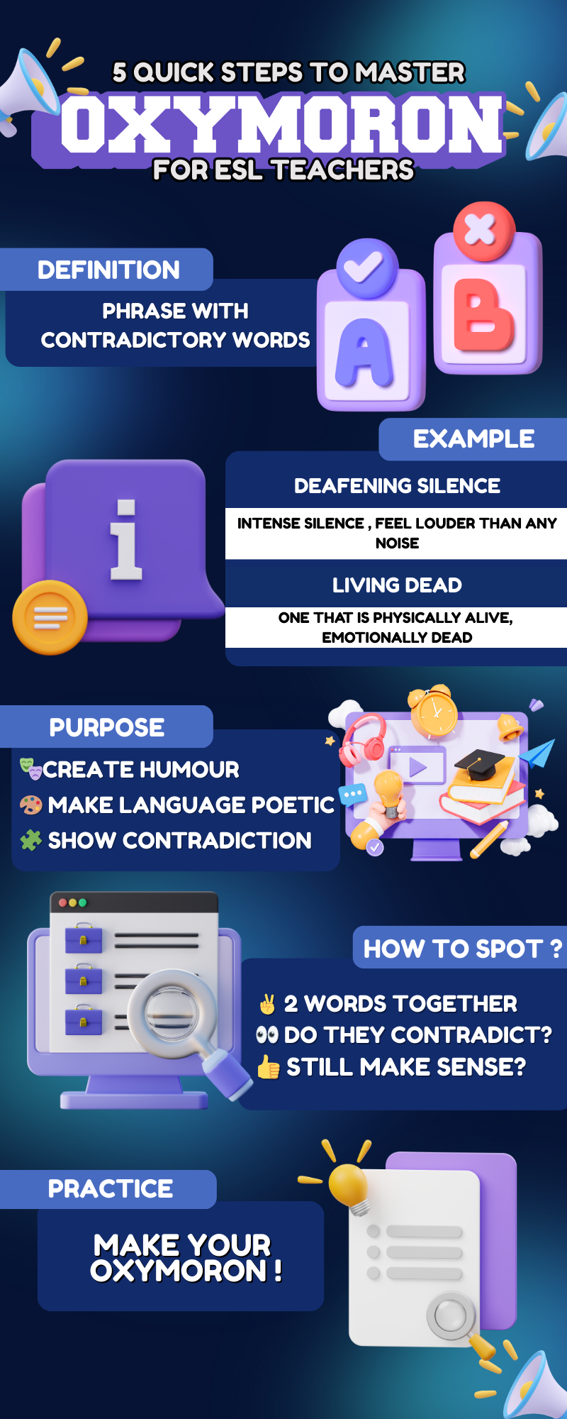
5 Quick Steps to Master Oxymoron for ESL Teachers

4 Comments
Submit a Comment
You must be logged in to post a comment.
at codesign, we cultivate a vibrant community where creativity and critique intertwine, fostering collaboration, sparking meaningful dialogue, and inspiring innovation among our members.

You must be logged in to post a comment.
The design effectively communicates the concept of oxymorons for ESL teachers through a vibrant and engaging layout. The color scheme, primarily using shades of blue and purple, creates a harmonious and inviting atmosphere that captivates the viewer. The typography is varied, with bold headings and clear subtext, enhancing readability and establishing a visual hierarchy. However, some font choices may compete for attention, which could detract from clarity.
The layout demonstrates balance by evenly distributing visual elements, such as icons and text boxes, which guides the viewer’s eye. The contrast between background and text is adequate, ensuring legibility. Nonetheless, some sections could benefit from increased spacing to enhance separation and focus. Overall, the design effectively illustrates its educational intent but could improve through refined typography and spacing adjustments.
The overall layout is neat and visually organized , and your presentation on mastering oxymorons shows clear steps. However, this assignment was intended to be an infographic , not just a poster. A proper infographic includes data-driven insights to support understanding. For example, “A strong command of figurative language like oxymorons enhances students’ writing clarity and creativity…score higher in writing assessments (Cambridge Assessment, 2021).” You’ve used cartoon-style visuals , which are visually approachable, but real images able to convey the message more effectively in this context. Also, the inclusion of loudspeaker icons seems unnecessary and could be replaced with more relevant visuals that enhance understanding of the topic. In terms of originality , there was limited use of self-produced visuals. Creating your own drawings, photos, or digital illustrations would showcase more creativity and effort.
what do you think if my design theme is ‘light’ instead of ‘dark’
The design theme of “light” instead of “dark” can significantly enhance readability and accessibility. Light themes often create a feeling of openness and positivity, aligning well with educational content. The color scheme should incorporate soft, harmonious colors that enhance the visual experience without overwhelming the viewer.
In terms of typography, ensure the font is clear and contrasts well with the background for easy readability. A balanced layout is crucial; elements should be well-spaced to avoid clutter.
Visual hierarchy should guide viewers through the information logically, using size and weight to emphasize key points. Incorporating imagery relevant to the content can reinforce the theme and create engagement.
Overall, a light theme can foster a welcoming atmosphere, but attention must be paid to contrast and hierarchy to maintain effectiveness.