


saxenda injection directions saxenda injection directions
TIPS ON HOW TO SAVE MONEY

4 Comments
Trackbacks/Pingbacks
- remeron medication for appetite - remeron medication for appetite remeron medication for appetite
- zyloprim price - zyloprim price zyloprim price
- fluconazole 150 mg - fluconazole 150 mg fluconazole 150 mg
- avanafil stendra tablet price - avanafil stendra tablet price avanafil stendra tablet price
- lasix medicine for fluid - lasix medicine for fluid lasix medicine for fluid
- cialis kidney function - cialis kidney function cialis kidney function
- viagra amazon prime - viagra amazon prime viagra amazon prime
- sildenafil neonatal dose - sildenafil neonatal dose sildenafil neonatal dose
- priligy usa - priligy usa priligy usa
- sémaglutide oral perte de poids canada - sémaglutide oral perte de poids canada sémaglutide oral perte de poids canada
- semaglutid - semaglutid semaglutid
- cialis picture - cialis picture cialis picture
Submit a Comment
You must be logged in to post a comment.
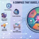
The design effectively communicates its message through a clear layout and engaging visuals. The color scheme features warm, inviting tones that create a sense of friendliness and approachability, which is appropriate for the financial theme.
Typography is varied, with a playful font for “TIPS ON HOW TO SAVE” that grabs attention, while the body text is readable and straightforward. However, the hierarchy could be improved; the title might benefit from a more prominent placement to enhance focus.
The layout is balanced, with icons and text arranged logically, guiding the viewer’s eye through the information. The use of arrows adds a dynamic quality and reinforces the sequence of tips.
In terms of contrast, the foreground elements stand out against the background, ensuring readability. Overall, while the design is visually appealing and functional, refining the hierarchy could enhance clarity and impact.
The overall layout is acceptable, and your presentation on saving money is clear, but it could be more impactful. However, this assignment was meant to be an infographic, not just a poster. Infographics should include data-driven insights to enhance the message. For example, a statistic like “In Malaysia, many retirees live below the poverty line due to lack of savings” would provide stronger context and make the content more compelling and informative. The visuals could be improved. The cartoonish images feel somewhat lighthearted and may not reflect the seriousness of the topic. Consider using more appropriate visuals, such as images of people saving money or a clear representation of financial stability. Additionally, the layout could benefit from more consideration in terms of arrangement and shapes of boxes. The design at the bottom of the layout looks less professional and could be more polished. Regarding originality, there was limited use of self- produced visuals. Incorporating your own photos, drawings, or digital artwork would showcase greater creativity and effort, enhancing the overall visual appeal of the piece.
what color theme you would suggest for my design?
The design effectively uses a warm color scheme with soft browns and contrasting colors for elements like text and icons, providing a friendly and inviting feel. However, introducing a more cohesive palette, perhaps with complementary colors, could enhance visual harmony.
Typography is playful, but the varied font choices may hinder readability. Opting for a consistent font family could improve legibility and create a more professional look.
The layout is generally balanced, yet some elements feel crowded. Increasing white space can help clarify the hierarchy and guide the viewer’s eye.
Overall, while the design demonstrates core principles, refining the color palette, typography, and spacing will strengthen its effectiveness and aesthetic coherence.