


saxenda injection directions saxenda injection directions
A BEGINNER’S GUILD TO SNAPPING PHOTO

4 Comments
Trackbacks/Pingbacks
- mobic medication for pain - mobic medication for pain mobic medication for pain
- doxycycline 100 mg - doxycycline 100 mg doxycycline 100 mg
- lasix generic brand - lasix generic brand lasix generic brand
- adoxa - adoxa adoxa
- xenical reviews nhs - xenical reviews nhs xenical reviews nhs
- cialis 5mg generic - cialis 5mg generic cialis 5mg generic
- buy vidalista 60 mg - buy vidalista 60 mg buy vidalista 60 mg
- avanafil or sildenafil - avanafil or sildenafil avanafil or sildenafil
- udenafil vs cialis - udenafil vs cialis udenafil vs cialis
- semaglutid kaufen polen - semaglutid kaufen polen semaglutid kaufen polen
- doxycycline 100mg how to take - doxycycline 100mg how to take doxycycline 100mg how to take
Submit a Comment
You must be logged in to post a comment.
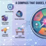
The image effectively utilizes a structured layout, presenting information in a clear, organized manner. The color scheme is cohesive, primarily using a neutral background that allows text and images to stand out, enhancing readability. Typography choices feature a mix of bold headings and regular text, ensuring a clear hierarchy that guides the viewer’s eye through the content.
Balance is achieved through symmetrical placement of text and images, while contrast is well-executed, making key points easily identifiable. The use of imagery, such as photographs and diagrams, supports the textual content, reinforcing key concepts like the rule of thirds and leading lines.
However, the layout could benefit from more white space to prevent visual clutter. Additionally, varying font sizes further could enhance emphasis on critical information. Overall, the design is effective in conveying foundational photography principles while maintaining aesthetic coherence.
The overall layout is neat and visually well-organized. However, to fully meet the infographic format, it would benefit from the inclusion of data-driven insights or impactful statistics to strengthen your message. For example, “Strong photos enhance message delivery by X%” would provide more context and make your content even more persuasive. That said, your overall design is excellent! It’s also great to see the use of self- produced visuals —this demonstrates creativity and originality. Well done!
What do you think of this image?
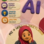
The design effectively employs a balanced layout, with clear sections that guide the viewer through different photography concepts. The color scheme, featuring a dark background and lighter text, creates strong contrast, enhancing readability. Typography choices are generally effective, with bold headings that establish hierarchy, though some body text could benefit from increased spacing for improved legibility.
Imagery is used appropriately to illustrate concepts, reinforcing the text. The visual hierarchy is clear, aiding in comprehension, but the overall aesthetic could be made more cohesive by aligning visual elements more consistently.
While the informational content is valuable, simplifying some areas and using more engaging visuals could enhance the design’s appeal. Overall, it demonstrates a solid understanding of fundamental design principles, with opportunities for refinement in aesthetic coherence and readability.