The design effectively communicates the benefits of AI in education through clear organization and visual appeal. The color scheme is…
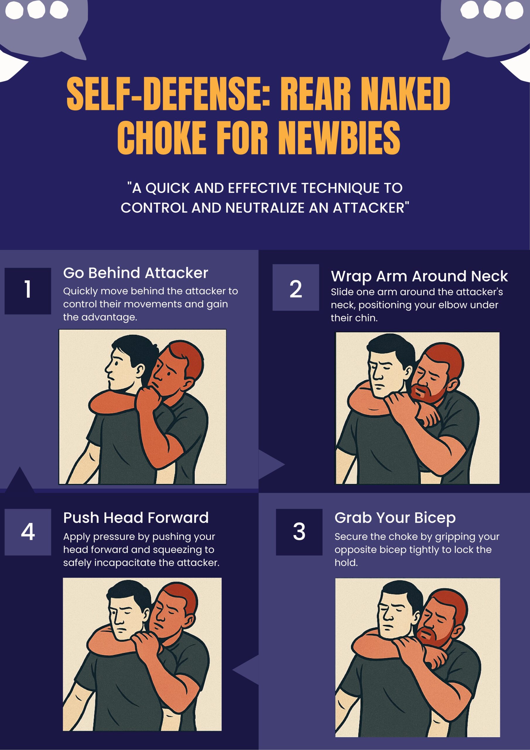
SELF-DEFENSE: REAR NAKED CHOKE FOR NEWBIES

4 Comments
Submit a Comment
You must be logged in to post a comment.
at codesign, we cultivate a vibrant community where creativity and critique intertwine, fostering collaboration, sparking meaningful dialogue, and inspiring innovation among our members.

You must be logged in to post a comment.
The design effectively communicates a self-defense technique, utilizing a cohesive color scheme of dark purple and contrasting lighter tones, which helps to guide the viewer’s focus. The layout is organized into a clear step-by-step format, ensuring good visual hierarchy. Each step is numbered, enhancing readability and making navigation intuitive.
Typography is consistent, with bold headings that stand out against the background, though some smaller text could benefit from increased contrast for better legibility. The images accompanying each step are illustrative, contributing to the overall understanding of the technique.
However, the use of a more varied font weight could enhance visual interest and emphasize key information. Additionally, ensuring that all imagery is equally well-rendered would improve aesthetic coherence. Overall, the design effectively balances informative content with visual appeal, though slight adjustments could enhance its clarity and engagement.
The overall layout is neat and visually organized , with relatable images that effectively support your message. The unique color palette gives off a retro vibe, which adds visual interest. However, the infographic lacks data-driven insights on the importance of self-defense. Since this is meant to be an infographic , incorporating impactful statistics would provide stronger context and help deliver a more compelling message. For instance, a fact like “1 in every XX Malaysians experienced harassment in 2024” could greatly enhance awareness. While the visuals are relevant, real images would make a stronger emotional impact. In terms of originality , there was limited use of self-produced visuals. Including your own photos, drawings, or digital artwork would show more creative effort and improve your score in that area.
Wow Nesh, the image looks good !
The design effectively demonstrates core principles of graphic design.
The color scheme, primarily featuring a deep purple background, creates a strong visual contrast with the lighter illustrations and text, enhancing readability. The typography is clear, using bold headings for steps that guide the viewer’s eye and establish a visual hierarchy.
The layout is well-balanced, with a logical progression from one step to the next, allowing for easy comprehension. The illustrations are appropriately sized and spaced, contributing to an aesthetically coherent design.
However, the text in the instructions could benefit from slightly larger font sizes for enhanced readability. Additionally, incorporating more visual elements to indicate movement or action could further engage the viewer. Overall, the design effectively communicates the technique while adhering to fundamental design principles.