


ivermectin treatment FAQ ivermectin treatment FAQ

codesign
at codesign, we cultivate a vibrant community where creativity and critique intertwine, fostering collaboration, sparking meaningful dialogue, and inspiring innovation among our members.
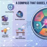
This design effectively communicates complex medical information in a visually engaging manner. The color scheme uses soft, calming hues that enhance readability and reduce visual strain, fostering a sense of trust. Typography choices are clear and legible, with distinct font sizes that establish a hierarchy, making it easy for viewers to navigate the content.
The layout is well-balanced, with symmetrical sections for “Gastric” and “GERD,” allowing for easy comparison. Visual imagery, such as icons and illustrations, adds warmth and aids understanding, while the use of bullet points enhances clarity.
However, the design could benefit from increased contrast between text and background in some areas to improve readability. Overall, the design effectively demonstrates core principles of graphic design while maintaining an accessible and informative tone.
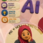
The overall layout is neat and visually organized , and the steps related to gastric and GERD are clearly presented. However, this assignment was meant to be an infographic , not just a poster. An infographic typically includes data-driven insights or impactful statistics to reinforce the message. For instance, a statement like “Untreated gastric and GERD may lead to more serious health issues (MOH, 2020)” would provide stronger context and enhance the impact of your content. In terms of visuals, try to standardize the style . You used cartoon-style images, but incorporating real or 3D visuals would give the infographic a more professional and compelling look. Regarding originality , there was limited use of self-produced visuals. Adding your own photos, illustrations, or digital artwork would showcase greater creative effort and improve your score in this category.
What do you think of this image?
This infographic effectively communicates complex medical information in an accessible manner, demonstrating several core design principles.
Color Scheme: The soft, pastel palette creates a calming effect, suitable for the health topic, while contrasting elements help delineate sections.
Typography: The font choices are clear and readable, with an appropriate hierarchy that guides the viewer’s eye from headings to body text.
Layout: The balanced composition, with a grid-like structure, organizes information efficiently, making it easy to digest.
Contrast: Sufficient contrast between text and background enhances readability, ensuring important details stand out.
Imagery: Illustrative icons support comprehension without overwhelming the text, reinforcing key points visually.
Overall, the design is coherent and well-executed, though further improvement could include increasing font size for enhanced accessibility and ensuring consistent spacing for better visual flow.