[…] and collectibles. We supply all your Van Halen & related merchandise in one convenient place fake yeezys, with wonderful…
codesign
at codesign, we cultivate a vibrant community where creativity and critique intertwine, fostering collaboration, sparking meaningful dialogue, and inspiring innovation among our members.

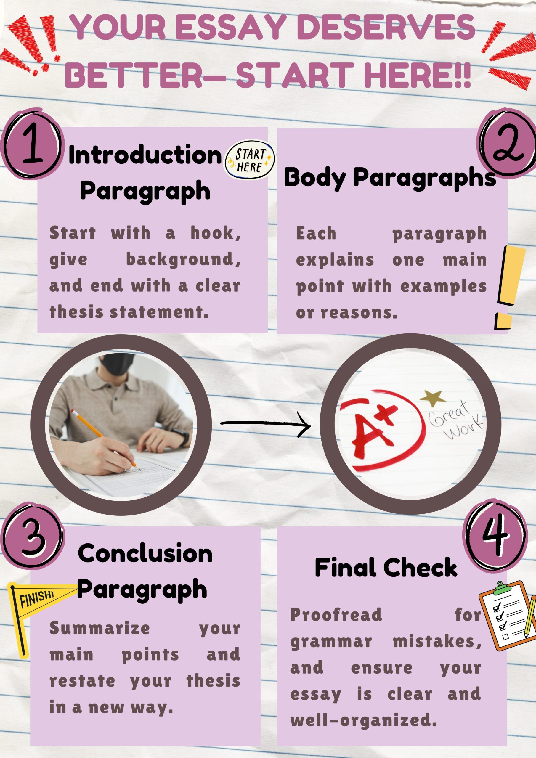

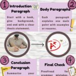

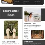

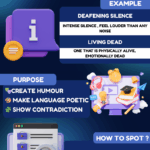
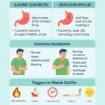


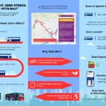
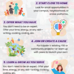
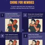

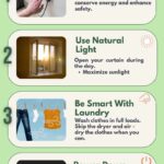
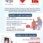
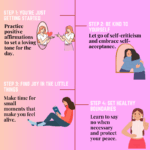
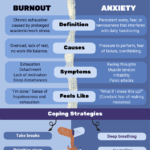

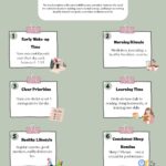
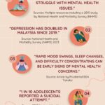
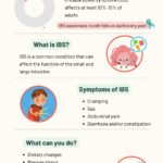
The design effectively communicates its message through a clear and engaging layout. The color scheme, featuring soft pinks and vibrant accents, creates visual interest while maintaining aesthetic coherence. However, the use of multiple font styles may disrupt readability; a more uniform approach could enhance clarity.
The layout is well-balanced, with distinct sections for each step in the essay-writing process, supported by relevant imagery. This hierarchy guides the viewer’s eye smoothly across the content. The inclusion of illustrations, such as the writing hand and grade icon, adds a personal touch and reinforces the theme.
While the design is visually appealing, simplifying typography and ensuring consistent font choices could improve overall readability. Strengthening contrast between text and background in some areas would also enhance legibility. Overall, the piece demonstrates a solid grasp of core design principles while leaving room for refinement.
The overall layout is acceptable , and your presentation on producing better essays is clear but could be more impactful. However, this assignment was meant to be an infographic , not just a poster. Infographics should include data-driven insights to enhance the message. For example, a statistic like “Good essay writing skills are strongly linked to career success, with X% of employers prioritizing written communication in hiring decisions” would make your content more compelling and informative. The visuals could be improved. The cartoonish images feel somewhat lighthearted and may not reflect the seriousness of the topic. Consider using more appropriate visuals, like an image of a person typing at a desk, or a visual representing the impact of good writing (e.g., a graph showing the correlation between essay quality and job success). Additionally, some elements like the crumpled paper seem unnecessary, and the text in brown on pink could benefit from a higher contrast for readability. In terms of originality , there was limited use of self-produced visuals . Incorporating your own photos, drawings, or digital artwork would demonstrate greater creative effort and enhance the visual appeal.
yay
The design effectively employs a playful color scheme with soft pastels, creating an inviting and approachable aesthetic. The use of contrasting colors for text and backgrounds enhances readability, though the pink font may not stand out as well against the background in some areas.
The layout demonstrates a clear hierarchy, with numbered sections guiding the viewer through the content systematically. The circular imagery draws attention to key points but could be better integrated with the text to enhance cohesion.
While the typography is generally readable, varying font weights could improve emphasis on critical information. The overall composition maintains balance, but additional white space could prevent visual clutter.
In summary, the design is engaging and functional, but refining the contrast and integrating text with imagery could significantly elevate its effectiveness.