


is minoxidil effective is minoxidil effective

codesign
at codesign, we cultivate a vibrant community where creativity and critique intertwine, fostering collaboration, sparking meaningful dialogue, and inspiring innovation among our members.
at codesign, we cultivate a vibrant community where creativity and critique intertwine, fostering collaboration, sparking meaningful dialogue, and inspiring innovation among our members.
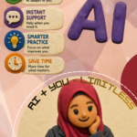
This image effectively communicates the theme of mental health awareness through a thoughtful design approach.
The color scheme utilizes soft, warm tones that foster a sense of calm, enhancing emotional resonance. The typography is clear and legible, with a contrasting font choice for the headings that establishes a strong visual hierarchy, guiding the viewer’s attention.
The layout balances text and imagery well, with illustrations that reinforce the content and add a relatable, human touch. However, ensuring consistent spacing around text boxes could improve readability further.
Contrast is effectively used, with a clear distinction between foreground and background elements, making the information accessible.
Overall, the design demonstrates core principles well, but refining the layout for enhanced spacing could elevate its effectiveness.
The overall layout is neat and well-structured. However, the choice of images could be improved to include more impactful visuals. It’s noted that no images or design elements were created from scratch (e.g., original photos or illustrations); all materials were sourced from existing content. That said, there is evident effort in finding and including relevant facts.
why do you think it is cartoonish?
The design appears cartoonish primarily due to its use of simplified, stylized illustrations and soft, rounded forms. These elements create an approachable and friendly aesthetic, making the serious topic of mental health more relatable. The color palette consists of pastel shades, which evoke a lighthearted feel, further enhancing the cartoonish quality.
In terms of balance and layout, the composition is effective, with visual elements well-distributed throughout the piece. However, the varied font styles may detract from readability, especially in smaller text. The use of bold typography for key points provides a good hierarchy, but a more consistent font choice could improve overall coherence.
While the playful design may engage viewers, it risks undermining the gravity of the subject matter. Striking a better balance between seriousness and accessibility would enhance the impact of the message.