


saxenda injection directions saxenda injection directions

codesign
at codesign, we cultivate a vibrant community where creativity and critique intertwine, fostering collaboration, sparking meaningful dialogue, and inspiring innovation among our members.
The design effectively communicates critical information about flood safety through a structured layout. The color scheme, with vibrant reds and calming blues, establishes urgency while maintaining readability. Typography choices are clear, though the title could benefit from a more consistent font weight to enhance hierarchy.
The layout is well-balanced, with sections logically organized under distinct headings. Visual hierarchy is supported by varying text sizes and the use of icons, which aid in quick comprehension of key points. However, the spacing between sections could be improved to enhance clarity.
Contrast is generally effective, ensuring that foreground elements stand out against the background. Overall, the design successfully conveys its message, but refining typography consistency and spacing could further improve its effectiveness and aesthetic coherence.
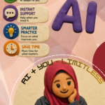
Overall Feedback: The layout is neat and well-organized. However, you could improve the consistency of your image choices by using all real images, instead of mixing them with cartoon- style images. Additionally, none of the images or design elements appear to have been created from scratch (e.g., own original photos or graphics); they all sourced from existing materials. The quality of the top images could be improved as well. That said, the rest of the content looks good, and you’ve done a great job of shortening the points for clarity. For the “Flood Preparation Matter” subtitle, it’s sufficient to keep it short, there’s no need for long points.
rate my design
The design effectively communicates important flood safety information through a clear hierarchical structure. The use of contrasting colors, particularly the red for headlines, captures attention and emphasizes urgency. The imagery is relevant and supports the message, providing visual interest without overwhelming the text.
Typography is mostly readable, though some font sizes in the body text could be larger to enhance legibility. The layout balances text and visuals well, guiding the reader through the content logically. However, some sections feel densely packed, which could deter quick reading.
In terms of aesthetic coherence, the color palette aligns with the theme of safety and urgency. Overall, the design successfully conveys its message but could improve readability and spacing for better user engagement.
Give feedback on my infographic
This infographic effectively utilizes color and imagery to communicate important flood safety information. The color scheme, dominated by blues and reds, creates a clear visual hierarchy, with the title standing out prominently. However, the choice of a bold font for “Banjiir Alert!” may detract from readability; a simpler typeface could enhance clarity.
The layout is organized, guiding the viewer through the stages of flood preparedness, but it could benefit from more consistent spacing between sections to improve balance. Icons accompanying text are effective in conveying messages quickly, yet ensuring uniformity in style and size would enhance coherence.
The contrast between text and background is generally strong, but some sections may require slight adjustments for improved legibility. Overall, while the infographic successfully conveys its message, refining typography and layout consistency could elevate its effectiveness.